When I worked at 2U, Inc., a company that partnered with universities to take their programs online, I initially joined the marketing team, building university program websites.
One day, leadership realized something crucial—our university websites weren’t ADA compliant, exposing us to significant legal risks. This revelation triggered a company-wide scramble. Our team had to urgently audit and update more than 20 sites, while other teams had to completely restructure major applications. This rushed remediation cost the company tens of thousands of dollars, and a lot of stress—all because accessibility wasn't considered from the start.
That lesson stuck with me.
Now, whenever I build products, accessibility isn’t a nice-to-have—it’s foundational. It should be prioritized like performance or mobile responsiveness. And interestingly, prioritizing accessibility often helps uncover bugs I would’ve otherwise overlooked.
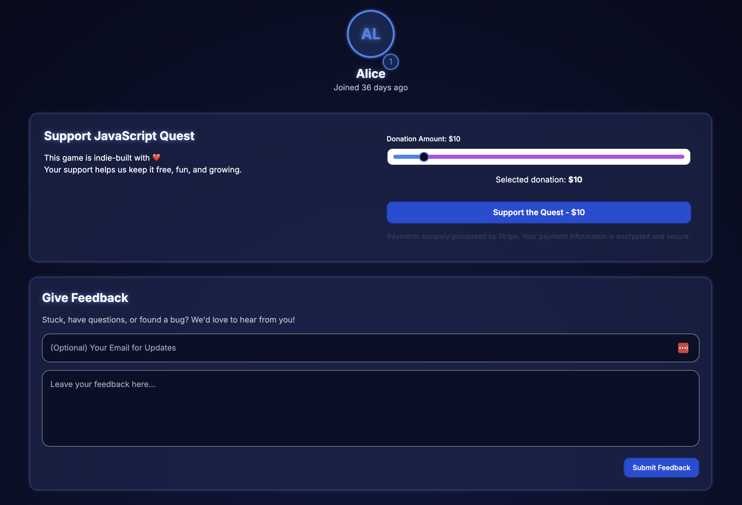
This app is built with Next.js, Tailwind CSS, and Radix UI components. The profile page lets users view donation history, manage preferences, and adjust recurring payment amounts.
Goal
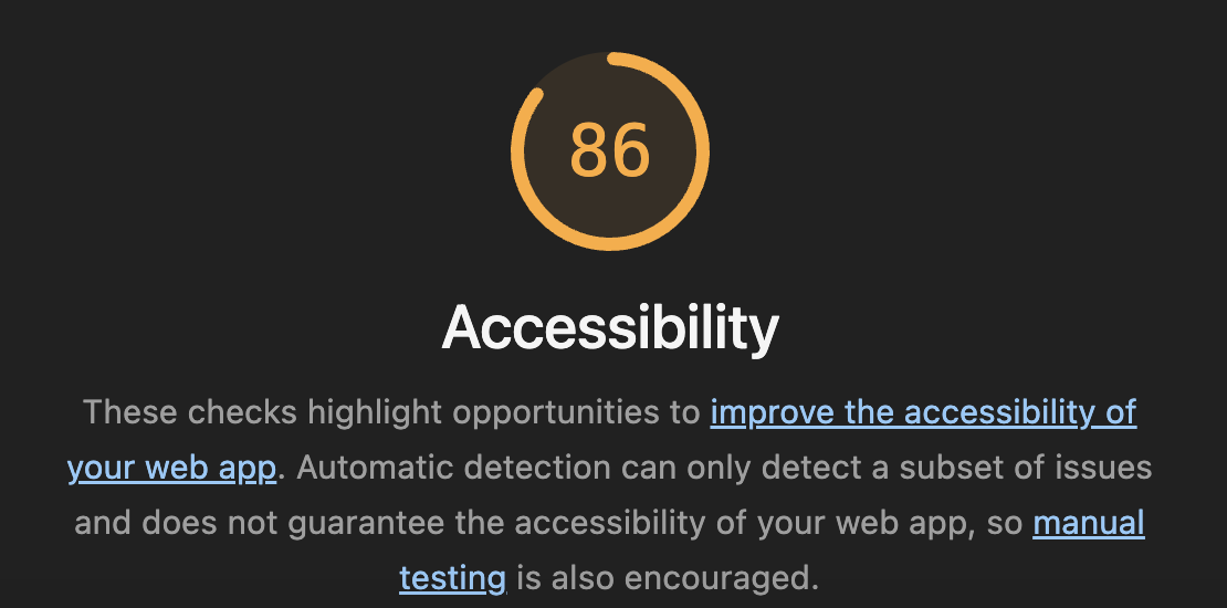
While auditing my site, I noticed that the profile page was the only one without a perfect Lighthouse accessibility score. Every other page passed with flying colors, so I dug in to figure out which elements were causing the issues.

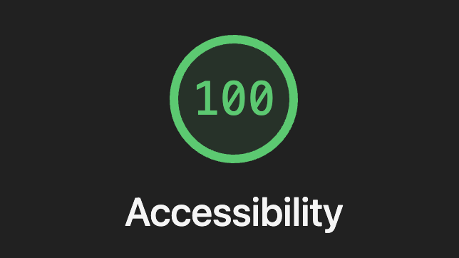
My goal was to bring the profile page to a 100 Lighthouse Accessibility score, by ensuring seamless functionality for screen readers, keyboard users, and high contrast modes
Accessibility Issues Identified
Lighthouse audit revealed three critical areas:
1. Buttons Without Accessible Names
- Icon-only buttons lacked
aria-labels, leaving assistive technologies unable to announce their purpose. - Why it matters: Screen reader users rely on accessible names to understand what a control does. Without a label, these buttons are announced simply as “button,” providing no actionable context.
2. ARIA Input Fields Missing Accessible Names
- Inputs and sliders didn’t use appropriate labeling, confusing screen reader users.
- Why it matters: ARIA (Accessible Rich Internet Applications) attributes help describe elements that don’t have native semantics. Fields missing labels create a confusing or unusable experience for assistive technology users.
3. Insufficient Contrast Ratios
- Background/foreground color combinations failed the 4.5:1 contrast ratio, particularly in dark mode or for visually impaired users.
- Why it matters: Low contrast text is difficult or impossible to read for users with low vision, color blindness, or in poor lighting conditions. The 4.5:1 ratio is the WCAG minimum for normal text.
Improvements Implemented
Enhanced Color Contrast
Before:


(The images are blurry because it's from a screenshot)
After:


- Switched to Tailwind's verified accessible colors.
- Confirmed compliance in both light and dark themes.
- Adjusted muted foreground colors for better visibility.
Donation Slider Context and ARIA Improvements
As part of this page, I introduced a donation slider using @radix-ui/react-slider. The idea was to let users easily scale how much they'd like to contribute, using a simple, interactive UI element. Sliders are powerful—but they're also tricky to make accessible, especially when using custom UI libraries.
Before:
After:
- Let
@radix-ui/react-slidermanage its own internal roles. - Provided one clear
aria-labeland utilizedaria-liveregions to announce dynamic content. - Why it matters: Using valid ARIA roles and live regions ensures screen readers can announce dynamic updates like slider values. Without this, changes may go unnoticed by users who can’t see the screen.
Comprehensive Input & Button Labeling
Examples:
- Ensured every interactive element had descriptive, screen reader-friendly labeling.
- Connected context with
aria-describedbywhere relevant. - Why it matters: Properly labeled form elements make forms understandable and navigable with screen readers. It’s the difference between hearing “edit text” versus “Email address, edit text.”
Structured Semantics and Dynamic Content Announcements
Improved structure:
- Introduced clear semantic landmarks and structured headings.
- Ensured dynamic updates were properly announced through live regions.
- Why it matters: Semantic HTML helps assistive tech build an accurate mental model of the page. Landmarks and headings enable efficient navigation. Live regions ensure users are notified of content changes without needing to manually refresh or search.
Enhanced Touch Targets & Focus Indicators
Example:
- Verified minimum touch-target size (44px+).
- Improved keyboard navigation with visible focus states.
- Why it matters: Mobile and touch users benefit from large, tappable areas. Keyboard users need clear visual cues to track focus position across the UI.
Result
A perfect 100 Lighthouse score for accessibility.

WCAG Principles Addressed
| Principle | Implementation |
|---|---|
| Perceivable | Enhanced contrast, clear labeling, structured headings |
| Operable | Accessible via keyboard, clear roles, visible focus states |
| Understandable | Clear labeling, live dynamic updates |
| Robust | Valid ARIA/HTML markup, thoroughly tested |
Key Takeaways
When developing a software product, it's important to run these tests to ensure that your application is accessible to all:
- Run a Lighthouse audit in Chrome DevTools
- Check contrast with tools like Accessible Colors
- Navigate your page using just the keyboard (Tab, Shift+Tab, Enter)
For more advanced testing, which I recommend for large-scale applications:
- Test with VoiceOver (Mac) or NVDA (Windows)
Accessibility isn’t merely about compliance—it's a fundamental part of building resilient, user-friendly products. In the process, I fixed overlooked bugs and made the overall user experience better for everyone. The inclusive design philosophy reinforces that optimizing for accessibility benefits all users—disabled or not.
Prioritizing accessibility upfront saves significant resources, enhances product quality, and improves user satisfaction across the board.